A selection of work spanning enterprise brands, global organizations, national institutions and public communications.
Municipal Property Assessment Corporation (MPAC)
Role: Enterprise Brand Identity | Design Systems | Brand Governance | Creative Direction
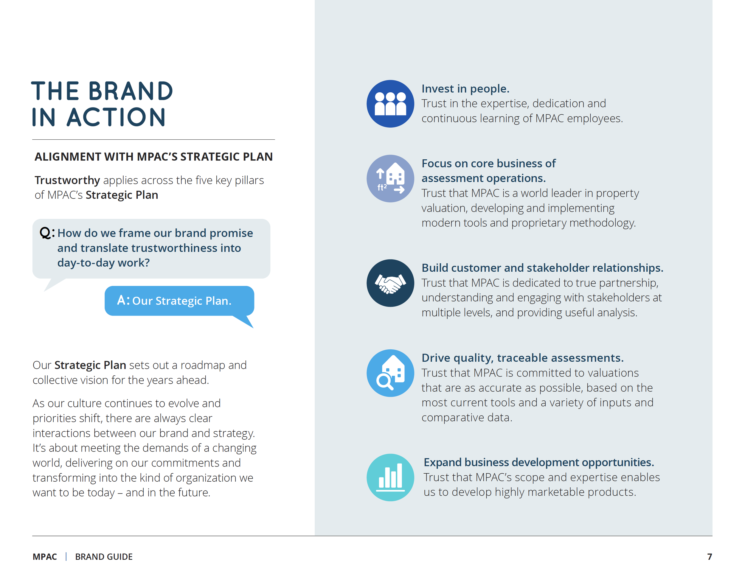
Brand: Developed and implemented an enterprise-wide visual identity system for MPAC, creating a scalable framework that enabled consistent brand application across every communication channel.
Audience: Supported an organization responsible for assessing more than $3.1 trillion in property value across Ontario, serving municipalities, government partners, 1,795 employees and millions of Ontario property taxpayers.
Approach: Developed a scalable enterprise identity system including typography, colour standards, document templates, presentation tools, photography guidelines and a province-wide image library, giving teams across MPAC's 26 Ontario offices the tools to communicate consistently.
Outcome: Delivered an enterprise brand system that empowered teams to communicate consistently, simplified brand decision-making and established a unified visual identity across the organization.
Canadian Venture Capital & Private Equity Association (CVCA)
Role: Enterprise Brand Identity | Design Systems | Brand Governance | Creative Direction

Brand: Developed a scalable brand identity system for CVCA, creating a consistent visual framework across the organization's communications.
Audience: Supporting Canada's private capital industry, whose members invest billions of dollars annually in Canadian companies, funding startups, scaling businesses and advancing innovation.
Approach: Developed a flexible identity system applied across research publications, conferences, digital platforms and member communications, enabling consistent brand application across every touchpoint.
Outcome: Established a cohesive brand system that strengthened consistency and helped CVCA present a unified voice across its national programs and industry initiatives.
Professionally Speaking / Pour parler profession
Role: Creative Direction | Brand Stewardship | Editorial Strategy | Photo Direction | Production Leadership

Brand: Creative leadership and long-term brand stewardship for Professionally Speaking / Pour parler profession, the official bilingual publication of the Ontario College of Teachers.
Audience: Distributed to more than 230,000 educators across Ontario, serving as the College's primary communication channel with its membership.
Approach: Provided creative leadership across editorial, photography, design and production while maintaining a consistent visual identity and evolving the publication over more than a decade.
Outcome: Strengthened and evolved the magazine's brand over 10+ years, earning 30+ national and international awards while reinforcing a trusted and consistent voice for the College.
Invest Canada Conference (CVCA)
Role: Sub-Brand Identity | Visual Systems | Event Experience | Creative Direction

Brand: Conference branding developed for the Invest Canada Conference, the flagship annual event of the Canadian Venture Capital & Private Equity Association.
Audience: Created for one of Canada’s leading gatherings of venture capital and private equity leaders, investors, and entrepreneurs.
Approach: Developed a distinct visual identity each year, applied across conference materials, environmental graphics, digital assets, and promotional communications.
Outcome: Established a cohesive brand experience that helped position Invest Canada as a premier event within Canada’s private capital industry.
Canadian Breast Cancer Foundation
CIBC Run for the Cure
Role: Creative Direction | Campaign Concept | Information Design | Visual Storytelling
Brand: A national awareness infographic for the Canadian Breast Cancer Foundation and CIBC Run for the Cure, designed to communicate the program’s impact and progress in breast cancer research and support.
Audience: Created for a broad Canadian audience, translating complex health statistics, fundraising results, and research outcomes into clear visual storytelling.
Approach: Developed a narrative infographic using strong visual hierarchy and data design to illustrate the scale of the initiative — including more than 2.25 million participants, 200,000 volunteers, and $45 million raised across 60+ communities.
Outcome: Communicated the national scale of the program while reinforcing the importance of continued research funding and public awareness.
Starbucks #150PlusWishes National Unity Campaign
Role: Creative Direction | Campaign Coordination | Artist & Production Leadership | Visual Storytelling

Brand: A national public art campaign for Starbucks Canada’s #150PlusWishes initiative, celebrating unity through artist-led installations across the country.
Audience: Created for a broad Canadian audience, turning public spaces into shared expressions of community and celebration.
Approach: Coordinated artists, photographers, and videographers across multiple cities to create installations launched simultaneously nationwide. The work was documented through film and photography, with selected artwork adapted into Starbucks gift card designs.
Outcome: Delivered a synchronized national activation combining public art, storytelling, and social content to amplify the #150Wishes message across Canada.
Starbucks Reserve Coffee Bar
Role: Creative Direction | Concept | Visual Tone | Storytelling | Photo & Video Direction

Brand: Launch campaign developed for the Starbucks Reserve Coffee Bar in Ottawa’s ByWard Market, introducing the brand’s premium small-batch coffee experience to the Canadian market.
Audience: Created to introduce Canadian customers to the Starbucks Reserve concept — rare coffees, immersive brewing methods, and a more refined retail experience.
Approach: Developed a visual campaign and storytelling system translating global Starbucks Reserve brand standards into a cohesive Canadian launch.
Outcome: Positioned the ByWard Market location as Canada’s first Starbucks Reserve Coffee Bar, establishing the concept as a premium destination experience.
Amazon Web Services
Role: Creative Direction | Concept | Visual Tone | Storytelling

Brand: A video project developed for Amazon Web Services supporting the Northern Brights initiative, designed to introduce the program to younger technology audiences.
Audience: Positioned the Northern Brights initiative for AWS’s global developer ecosystem, reaching a community of millions of technologists and builders worldwide.
Approach: Used fast-paced editing, bold visuals, and music-driven storytelling to shift the tone closer to contemporary media than traditional corporate messaging.
Outcome: Turned a complex cloud initiative into a clear, visually engaging introduction designed to resonate with emerging technology audiences.
Ontario Ministry of Energy - Phantom Power Awareness Campaign
Role: Creative Direction | Concept | Visual Tone | Storytelling

Brand: A public awareness video for the Ontario Ministry of Energy highlighting the hidden energy waste caused by “phantom power” from everyday household devices.
Audience: Created for a broad Ontario audience, translating energy conservation concepts into an engaging and accessible story for everyday households.
Approach: Led the full creative production process — from concept development, casting, location scouting, and costume design to coordinating the film crew, directing the shoot, and overseeing editing through final delivery.
Outcome: Delivered a clear and memorable video campaign helping the Ministry communicate energy conservation in a way that felt practical, relatable, and easy for the public to understand.
Ontario Ministry of Energy
Role: Creative Direction | Concept | Visual Tone | Storytelling

Brand: A publication series developed for the Ontario Ministry of Energy, translating complex energy policy and programs into clear public-facing communications.
Audience: Designed for a broad Ontario public audience, helping communicate energy policy, conservation programs, and emerging clean energy initiatives.
Approach: Created a clear visual system and publication series that translated complex technical and policy information into accessible, easy-to-understand materials.
Outcome: Established a consistent design framework supporting multiple publications and improving clarity across public communications.
CAA Membership Savings Campaign
Role: Creative Direction | Campaign Concept | Visual Tone | Storytelling

Brand: Integrated campaign developed for CAA highlighting the everyday savings and practical benefits of membership.
Audience: Designed to engage both existing members and prospective ones across an organization serving more than 6 million members across Canada.
Approach: Developed a cohesive campaign platform spanning video, digital, and print, with messaging tailored to both retention and acquisition audiences.
Outcome: Reinforced CAA’s role as a trusted partner on and off the road while clearly communicating the tangible value of membership.
Cancer Care Ontario
Role: Creative Direction | Campaign Concept | Visual Storytelling | Digital Design

Brand: Digital awareness campaign developed for Cancer Care Ontario helping Ontarians understand how everyday lifestyle choices can reduce cancer risk.
Audience: Created for a broad public audience across Ontario, translating health research and prevention guidance into accessible digital messaging.
Approach: Developed a series of digital advertisements and visual content using clear messaging and approachable design to communicate practical prevention tips.
Outcome: Delivered a scalable digital campaign supporting Cancer Care Ontario’s mission to improve public awareness around cancer prevention.
State Farm Insurance
Role: Creative Direction | Campaign Concept | Visual Storytelling | Video & Content Direction

Brand: Integrated awareness campaign developed for State Farm Canada translating road safety research into accessible digital and social content.
Audience: Developed to reach millions of Canadian drivers, supporting safety messaging across an insurer serving roughly 2 million customers nationwide.
Approach: Created a coordinated series of infographics and short-form videos, translating complex research and statistics into clear, engaging visual storytelling.
Outcome: Delivered a cohesive digital campaign helping State Farm communicate critical road safety issues in a way that felt informative, responsible, and shareable.